
IRS Individual Online Account: Profile Page Redesign
OVERVIEW
Redesigning the IRS Individual Online Account’s profile page for improved usability, organizational structure, and scalability
The IRS Individual Online Account (IOLA) profile page was cluttered, unorganized, and redundant, making navigation difficult. Additionally, with the IRS looking to add additional features down the road, the profile page was not built for scalability. The objective was to redesign the profile page to enhance usability and provide a clear organizational structure that aligns with user needs.
Timeline
Nov 2024 - Dec 2024
Team
Tien Tran
Ariella Brown
Jaclyn Chin
Role
Lead UX Designer
Methods
Low/High Fidelity Wireframing
Prototyping
Heuristic Analysis
Competitive Analysis
Objectives
01
Streamline the layout of the profile page for better usability and accessibility.
02
Enhance the visual hierarchy to make key information more prominent.
03
Organize the profile page for scalability.
Before → After

RESEARCHCompetitive analysis
We examined the profile pages of a diverse set of systems to identify effective design patterns. Noteworthy aspects included:
01
Use of clear categories and subsections for organizing information.
02
Consistent design patterns across all elements.
03
User-friendly navigation that allows quick access to information, preferences, and tools.
DESIGN PROCESSBrainstorming and ideation
We held brainstorming sessions with the design, development, and business teams to ideate solutions. Specifically, I held weekly design reviews with stakeholders to gather feedback, worked closely with developers to ensure design feasibility, and coordinated with the content team to ensure clarity and consistency in messaging.
Key ideas generated included:
01
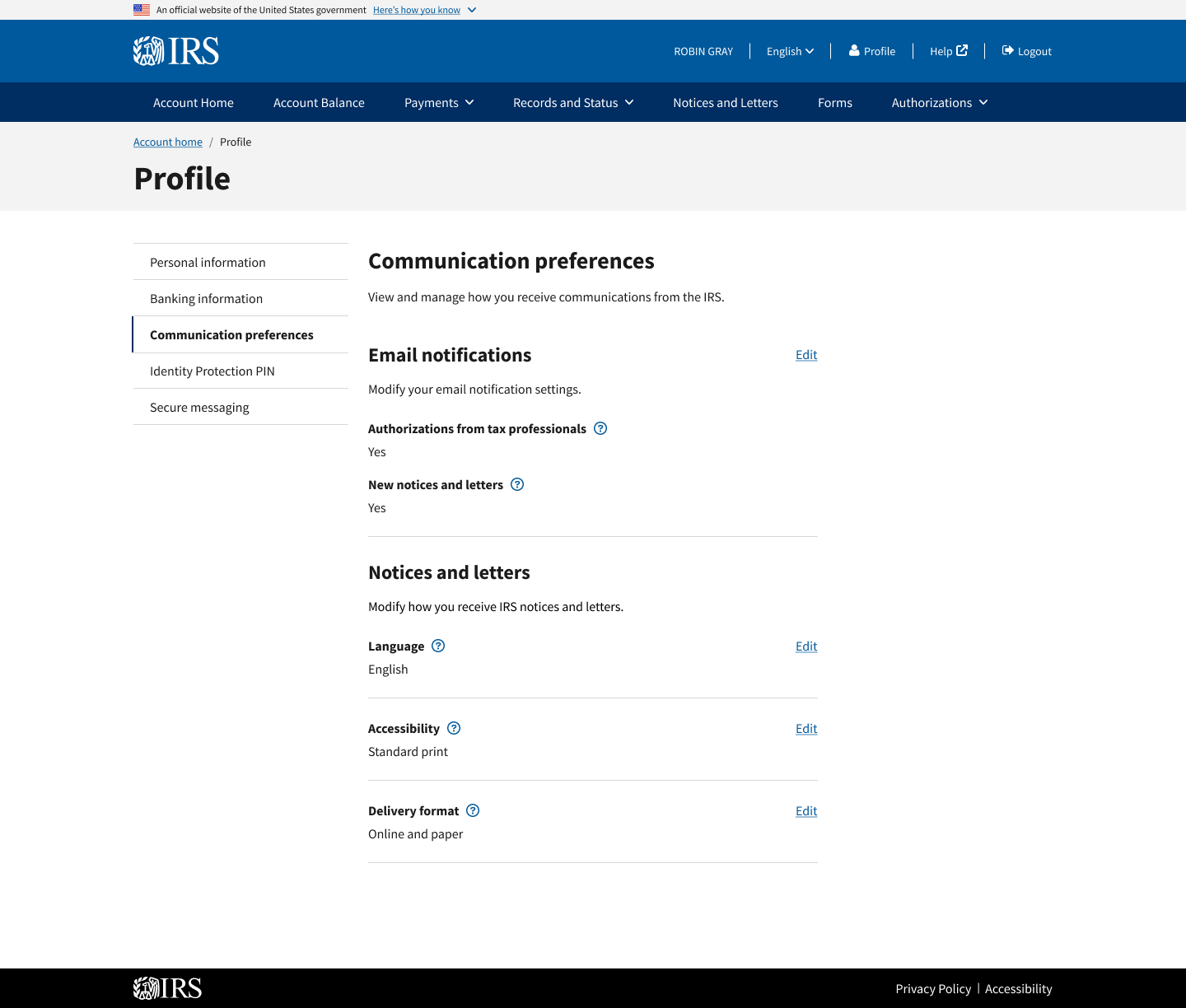
Organizing the profile page into clearly defined sections (e.g., Personal information, Banking information, Communication preferences, IP PIN, and Secure messaging.
02
Utilizing visual hierarchy to highlight important elements on the screen.
03
Applying sentence casing across all elements for increased readability.
04
Using consistent design patterns to create a cleaner layout.
Low-fidelity wireframes
Protoyping
The high-fidelity prototype was developed in Figma, showcasing:
A clean and modern layout with consistent typography and visual elements.
A sidebar navigation for quick access to each section of the profile page.
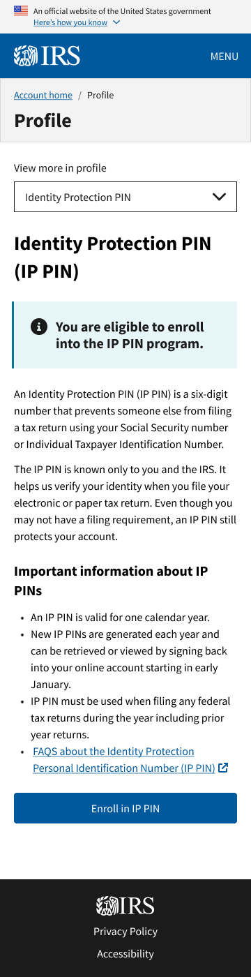
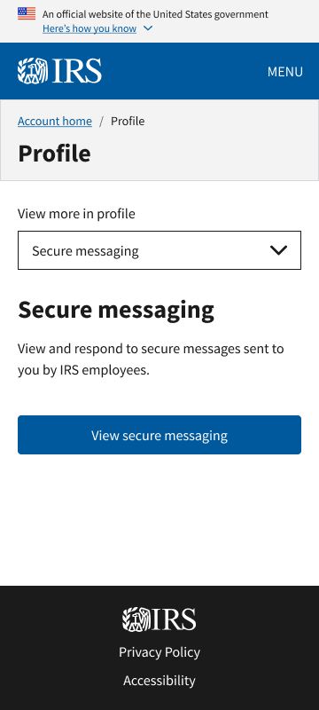
A dropdown menu for mobile navigation.

Interactive prototype
HUERISTIC EVALUATION
Evaluation overview
Due to time constraints, we were unable to test the new designs with users, but we were able to conduct a heuristic evaluation with 6 teammates who had never seen the designs beforehand. Participants were asked to evaluate the proposed designs against Jakob Nielsen’s 10 usability heuristics.
Findings and notes for iterations
Testing revealed several insights:
01
The original card design was unnecessary and added extra UI with no benefit.
02
The ‘Edit’ links on the “Communication preferences” page were inconsistent.
03
The original UI overexplained information and used repetitive headers.
04
The ‘Add bank account’ form was long, so there needed to be a way for users to exit that flow without excessive scrolling
FINAL DESIGNVisual design
The final profile page design featured:
A modern and professional aesthetic.
A clear visual hierarchy that emphasizes important information, with large headings and consistent section patterns.
A user-friendly layout that balances text with interactivity to engage users.
Sentence casing for increased readability.
Key features
Personal information tab: Displays essential information at a glance, including name, email, and address.
Banking information tab: Presents the user's saved bank accounts and gives them the ability to add/delete accounts.
Notification preferences tab: Allows the user to adjust their communication preferences.
IP PIN tab: Easy access to the user's IP PIN, with the option to enroll for one, if the user doesn't already have an IP PIN.
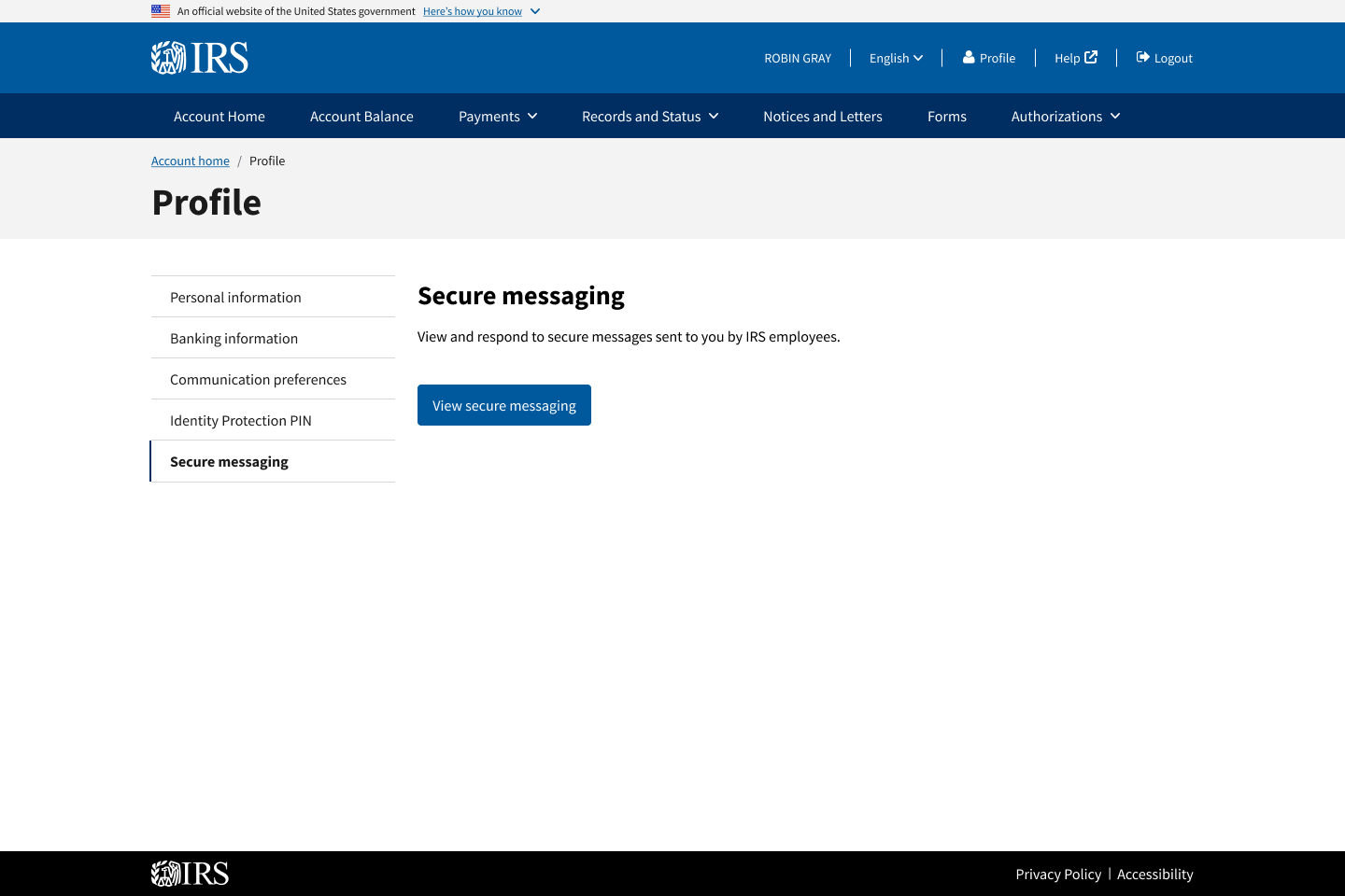
Secure messaging tab: Gives the user access to the secure messaging feature.


Impact
With the visual update to utilize consistent design patterns, users will have stronger trust in the IRS. Additionally, the profile page matches the user’s mental model of what other profile pages look like in other applications.
Ultimately, the major result of this project is highlighted by the organization of the profile page. As mentioned earlier in this case study, IOLA is planning on adding numerous features in the future, so building out the profile page in a way that allows for scalability will reduce development cost and usability issues. The updated page launched on time, received positive feedback from internal stakeholders, and set a new baseline for profile scalability.