Overview

The Project
As a student of the UX Design Program at the Launch Academy at Forge, my partner, Kimberly Vo, and I were tasked with designing a web and mobile budgeting app for Gen Z college students.
Problem Statement
How might we design a web and mobile app that allows Gen Z college students to create a monthly budget and track their spending?
My Role
User research, Interaction Design, Visual Design
Duration
1 Week
Tools Used
Figma, Whimsical, Zoom
Team
Tien Tran and Kimberly Vo
User Research
A total of 4 non-directed interviews, and 4 ethnographic interviews using Buddy and Every Dollar as competitor apps were conducted. All of the interviews were 1:1 and were conducted using Zoom. Our target demographic were individuals in the age range from 19 to 23, current students or alumni, with varying experience with budgeting.
-
1. How do you normally budget your money?
2. Have you used any tools to help? If so, please explain.
3. When was the last time you had to save up for something or to pay off something?
4. What did you do to meet this goal?
5. What are some key factors that go into making your budget?
6. What are your main reasons for keeping a budget?
7. How far in advance do you budget?
8. Is there any particular reason for this?
-
1. Could you show me how you would create a new budget?
2. Could you show me how you would log a transaction
3. Could you change income to $3,000?
4. Could you flip to a different week?
5. What features did you find most useful?
6. Would you or would you not use this app and why?
-
1. Could you show me how to make a new budget for August?
2. Could you walk me through the process of adding an item to the food category?
3. Could you walk me through submitting and transaction?
4. Could you show me how you would change your income amount?
5. Could you show me how you would delete an item?
6. Could you walk me through how you would set a due date for an item?
Key Takeaways
-
1. 3/4 participants budget through their banking app.
2. Growing up, parents took care of 3/4 participants’ finances
3. 4/4 participants budget for security and flexibility
4. Goals, reminders, and helpful tips were mentioned when asked what would motivate participants to budget
-
1. General naviagtion was simple
2. People took different navigation paths
3. Swipe to delete was well understood and used
4. “It’s just a fancy calculator”
-
1. Easy navigation throughout the app
2. Editing was challenging
3. Various ways to delete items
Use Case
After user research was conducted, we came up with our primary use case, making a budget. Our main actor is Corey who is heading off to college and wants to manage his money better. His basic flow would be to create an account with Divvy, does not link his bank account with the app, inputs his expected income and expenses, and tracks his transactions as he makes them. Shown below is a more detailed use case scenario.

Journey Map
Corey the College Student
Age: 19
Location: Charlottesville, VA
Intended Major: Computer Science
Scenario: Corey is about to head off for college. He will be attending the University of Virginia in pursuit of a degree in computer science. Before going to college, he wants to start a budget so that he can be more mindful about his spending habits
User Expectations: Corey expects the Divvy app to track his finances in a digestible manner and be easy to use.


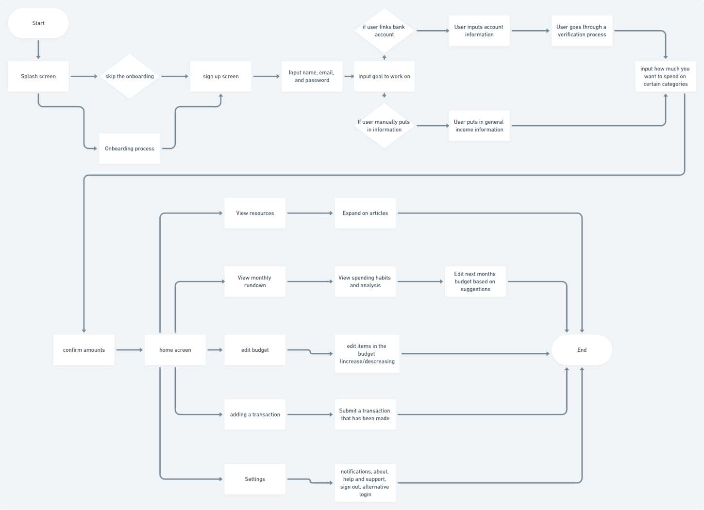
User Flow Chart
Through the use case and journey map, we were then able to create a flow chart for our budgeting app. The flow chart was made in Whimsical and helped us visualize the flow of our app. Additionally, because we found that most of our participants during user research never budgeted before, the flow chart helped us determine that we wanted to put an emphasis on helping users who are new to budgeting. Below is the general flow of using the Divvy budgeting app.
Wireframes
To put everything we gathered up to this point together, we created grayscale wireframes to detail out the flows for both the mobile and desktop apps. These wireframes help with visualizing what we wanted on our app as well as where we wanted to place them. Shown below are some of the mid-fidelity wireframes that we created.


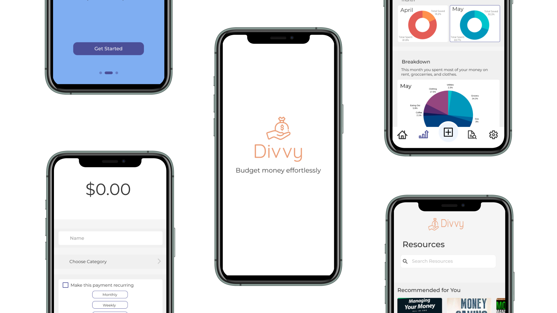
Final Mockups
After creating the mid-fidelity wireframes we created the high-fidelity mockups. Shown below are the primary screens when using the Divvy mobile app. For the desktop app, we were only tasked with created the onboarding process.
Mobile Mockups


Desktop Mockups


Usability Testing
Once we created the high-fidelity mockups, I prototyped the mobile app so that we could usability test our initial design. We usability tested with another group within the Launch program that had never seen our app beforehand, and we were able to get very valuable insight on what could be improved with our app. After usability testing we made changes to our app accordingly. Shown below is a list of key takeaways from usability testing.
-
1. Make the transitions on the splash page slower
2. Find a way to reorganize delete function to be more intuitive
3. Make a more noticable way for users to exit pop-ups
4. Focus on consistent branding with logos
5. Edit page cues were redundant
Prototype and Project Learnings
We ended our project by finishing up our finalized prototype. Though the project only lasted a week, I learned many lessons. Specifically, I learned just how important user research was and how important it is to work as a team when designing. Without user research, there was no way our app would have turned out the way it did. The user interviews and usability tests pointed out unexpected information and helped us better design our product for the target audience. Additionally, working with Kimberly was very fun along with helpful as we were able to bounce ideas off of each other and provide advice whenever either of us were stuck.